In the health field, we often have access to lots of data. With an eye on improving the quality of health service delivery, information is collected through every level of the health system.
Yet, there are very few settings around the world where data is being used optimally. When valuable health information is hidden in piles of dusty register books or complex databases, health workers, managers, and policymakers are not able to use that data for clinical or programmatic decision-making.
What can we do to get health data out of the spreadsheets and into the streets? One solution is to improve how we are visualizing our data so that it is more understandable and, therefore, more actionable.
The practice of data visualization involves taking a data set and presenting it pictorially or graphically so that it is easier to process. The human brain can interpret data presented in charts, graphs, and other graphics much faster and easier than in tables or narrative reports. By applying data visualization best practices, we can also support decision makers by identifying key insights and trends in data. Presenting data in an effective way helps important messages stand out.
Here’s an example: which of the two images below shows family planning (FP) data in a way that promotes action to be taken?
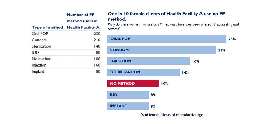
In Figure B, we can easily see that 10% of female clients of the health facility use no FP. The data is sorted from the most used method to the least used. Using a brighter color for the “no method” data draws the reader’s eye immediately. The reader might then may try to find out why these women are not using an FP method, and if those women are interested in accessing FP counseling and services.
Data visualization also helps us to target key messages to different audiences. A chart formulated for an audience of researchers may not necessarily be digestible or useful for an audience of health managers from a ministry of health, for example. Before you visualize your data, think about the audience that you are trying to reach. What information are they interested in, and what action do you want them to take based on the data?
“Tailoring visualizations to different audiences is critical. How a health worker or policymaker responds to a chart is colored by their statistical knowledge, cultural context, and ability to act on the information,” said Amanda Makulec, Data Visualization Lead at Excella Consulting. “Ultimately, we need to display data in charts that enhance understanding. That can often mean relying on simple charts – like bars and lines – that may not look novel, but are easy to understand and act on.”
Here’s an example: which of the two charts below presents FP data in a way that would be actionable for a health system planner or ministry of health?
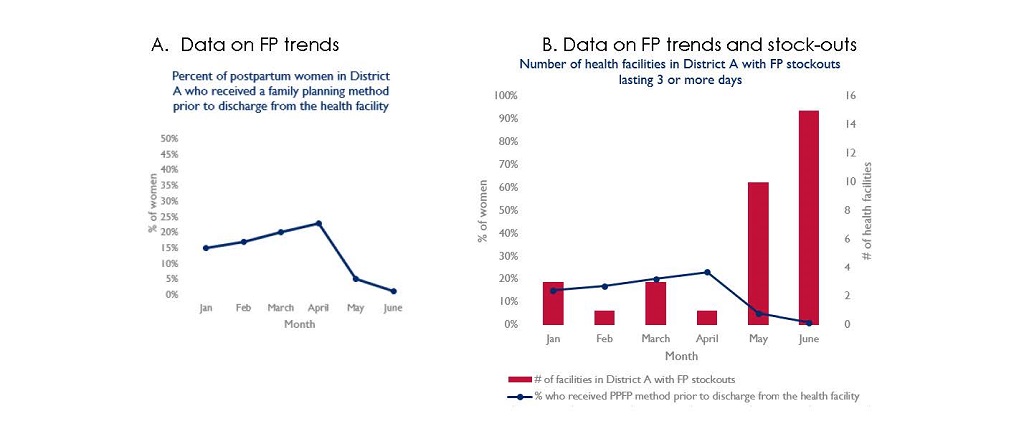
The second chart above not only shows health system planners that there has been a sharp decline in postpartum family planning (PPFP) uptake in the district, but also identifies that stock-outs of FP commodities in the district may be a contributing factor. In the months where PPFP uptake is the lowest, many facilities in the district had stock-outs and, therefore, could not provide PPFP services prior to postpartum women leaving the health facility. Health system planners or ministries of health could use this information to allocate resources needed to address the stock-outs and improve PPFP uptake in the district.
At MCSP, we see data visualization as an important step toward overall improved data use. In addition to disseminating data visualization tools and training resources to our country teams, we work with health facilities and ministries of health to introduce or expand use of data dashboards to support decision-making. We’ve also trained facility health workers to transfer clinical data from registers or log books to wall charts, and supported field-based teams by designing presentations and infographics that help them communicate complex monitoring and research data to diverse audiences.
Improving how data is visualized and used is an ongoing and iterative learning process. From the smallest rural health clinic to the World Health Organization, health professionals are using data visualization to recognize health trends, prioritize resources, and make clinical and programmatic decisions.
“The wider field of data visualization has grown rapidly, with the introduction of more web-based dashboarding platforms, new integration of advanced analytics into dashboards, and more,” Makulec said. “All of this technology advancement is exciting, but should not overshadow the value of making steps forward from tables and registers to wall charts, quickly sketched visuals, and crafting charts in widely-used tools like Excel. The tool used for visualization matters far less than delivering charts, maps, and graphs that empower more evidence-based decisions.”
As our own teams continue to develop these skills, MCSP sees more examples in the field of additional uses for effective data visualization. By applying simple data visualization best practices, we can all improve how we are communicating health data and empowering decision makers to take action.